
The problem
GHC Advogados. Two partners, four years in, competing for mining and energy clients against firms ten times their size. They asked to "look more professional." Discovery showed that was a symptom.
Their real advantage was structural and invisible. Both partners had worked the client's side of the table: 40 years public sector, 10+ years in-house. They read an industrial client's business like an owner, not a vendor. Nothing in their brand communicated it.
Reframed problem: make a small firm read as credible to industrial clients, without inheriting the cold, impersonal signals of the big firms those clients are trying to leave.
Approach
A structured branding process built to front-load alignment, so production runs on agreement instead of assumption. A flow corrected at the strategy stage costs a fraction of one corrected after launch.
Discovery. Four attributes mapped, then synthesized into a single positioning statement.
- Radical loyalty
- Rigor with warmth
- Dual perspective
- Fruitful growth
Synthesis: Humanize corporate law: technical rigor and lasting relationships, to protect legacies.
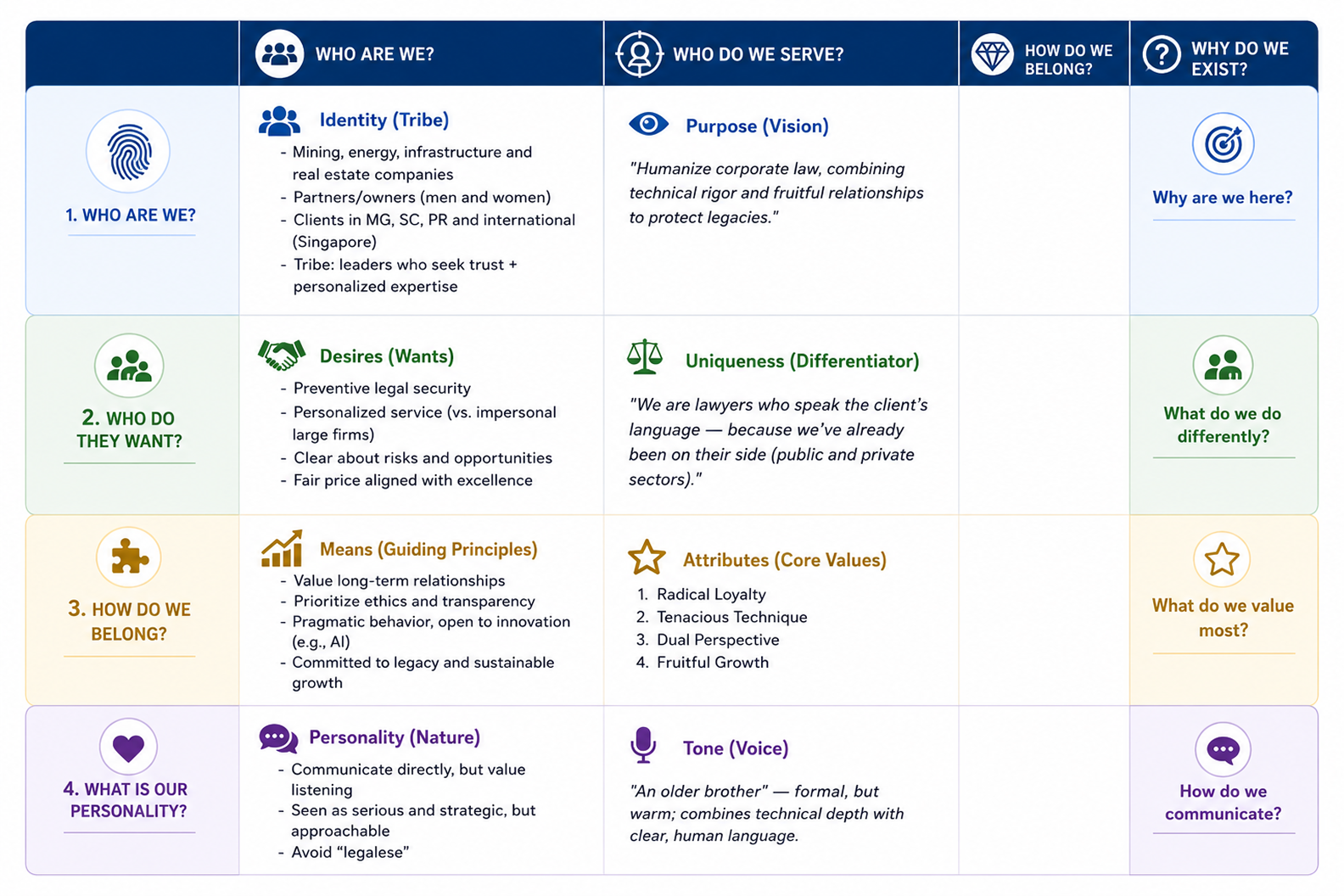
Alignment: An 18-slide playback presented and confirmed with the partners before any design, converting research into a shared, signed-off direction.
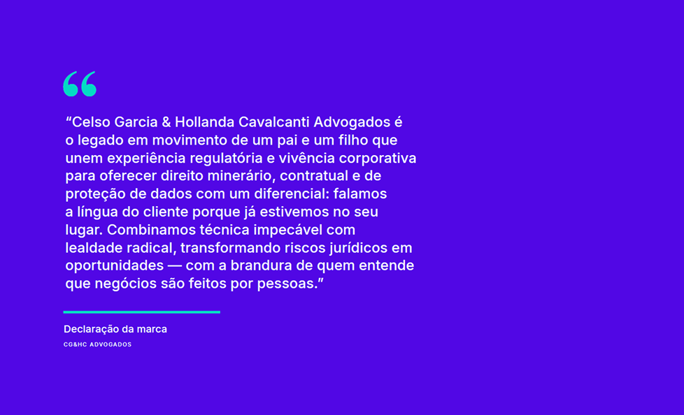
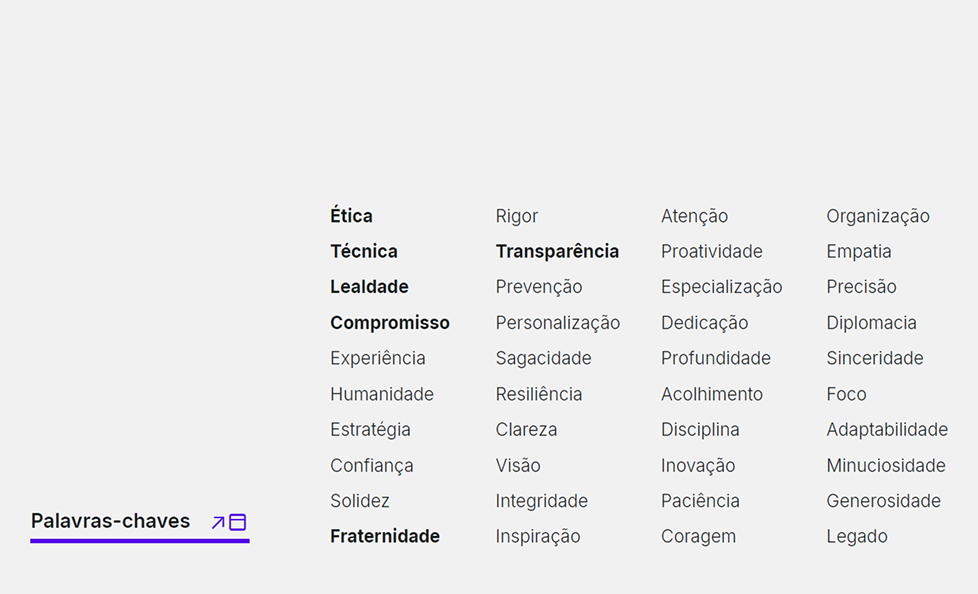
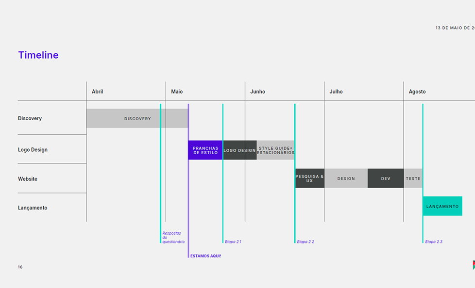
Key decisions
Stylescapes as a deliberate range. Three directions, from conservative to bolder, each mapped to an attribute, so convergence was evidence-based rather than taste-based. The partners aligned on the first round. No fourth board needed.

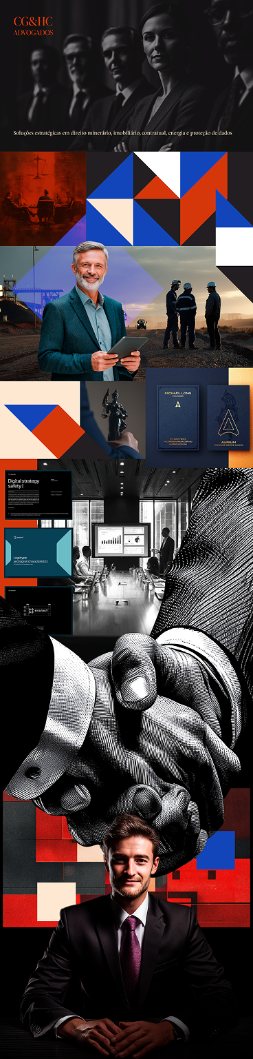

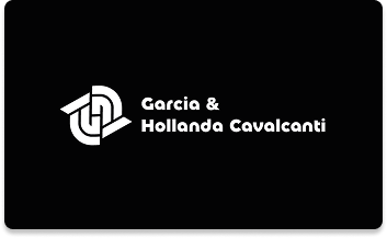
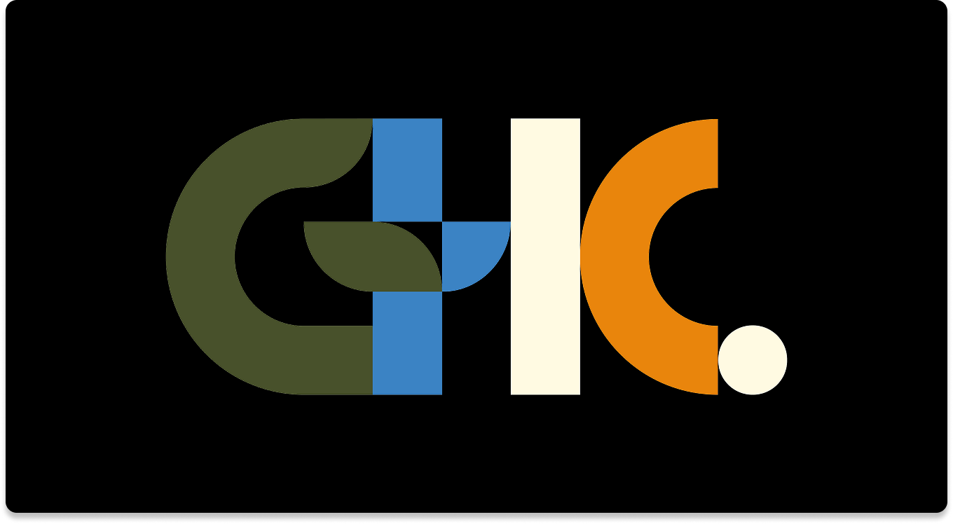
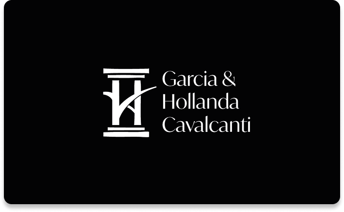
A logo system where each mark is an argument. Three proposals, each tracing a documented rationale from the partners' surnames. The reasoning was the deliverable; the mark, the proof.
Built for change: Mid-project the firm dropped its leading "C" (Celso Garcia & Hollanda Cavalcanti → Garcia & Hollanda Cavalcanti). The system absorbed the rename without redesign, because it was built on values rather than a fixed letterform.
Delivery
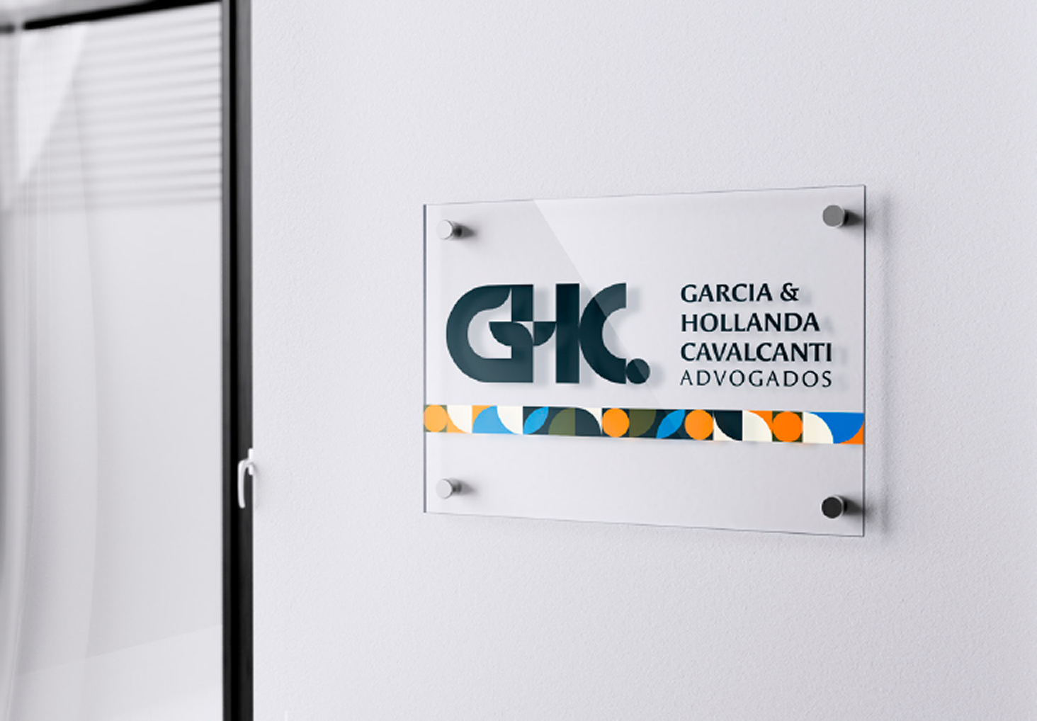
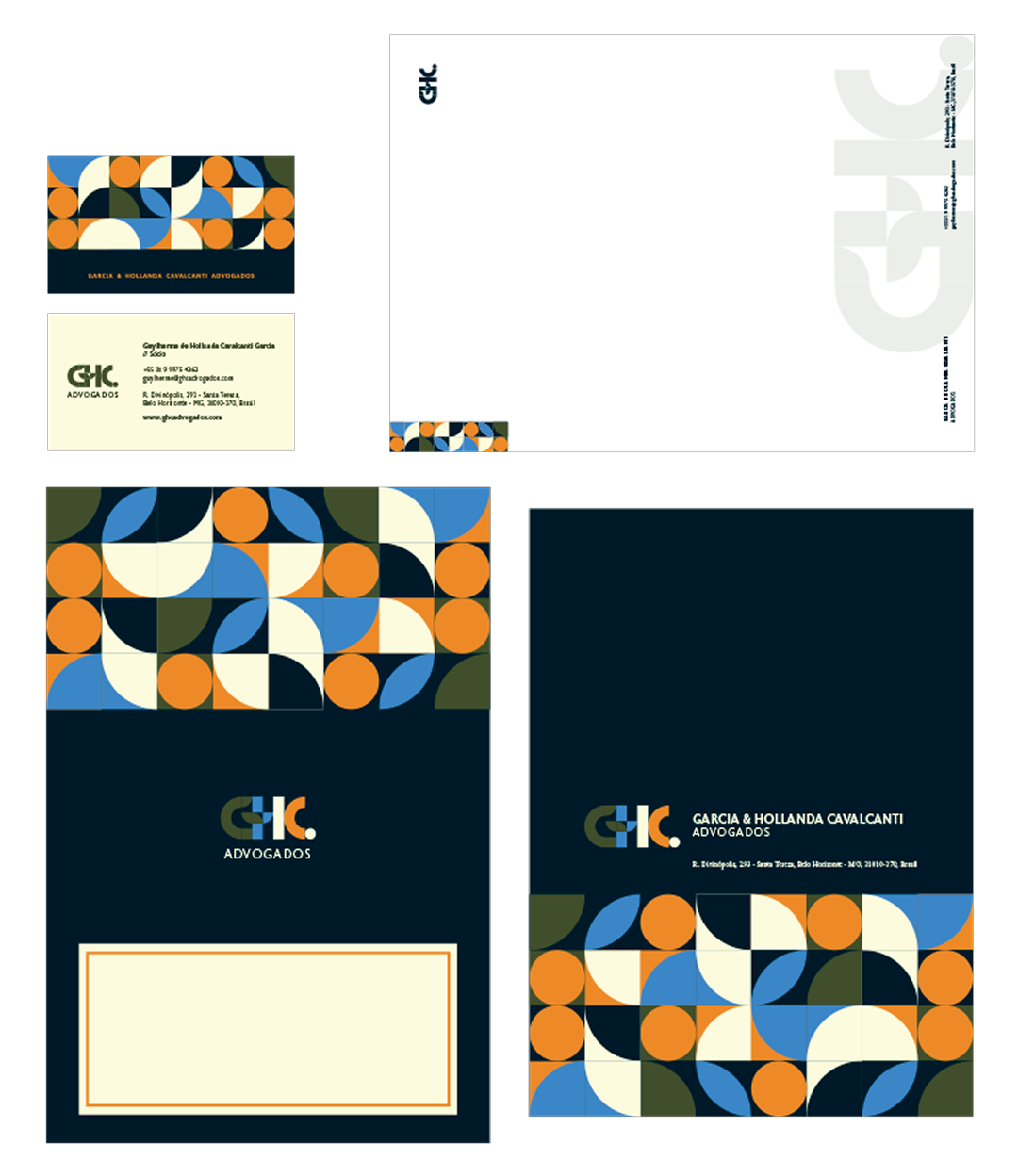
Full identity system shipped: business cards, letterhead, envelopes, frosted-glass office signage, and LinkedIn presence. All carrying the monogram's geometric language.
A scoped second phase delivered the website: a fast, readable landing page built to explain the firm and convert a prospect to contact in one move. Legibility over feature bloat, with light SEO groundwork.
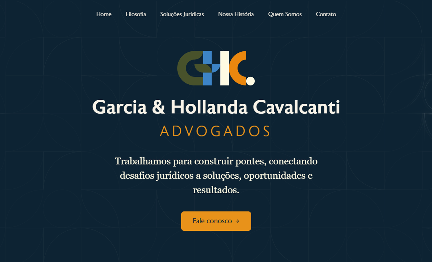
Live → www.ghcadvogados.com
Outcome
Shipped end to end. Strategy, identity, print system and live site, with no rework rounds, holding through a mid-project timeline shift without unresolved friction.
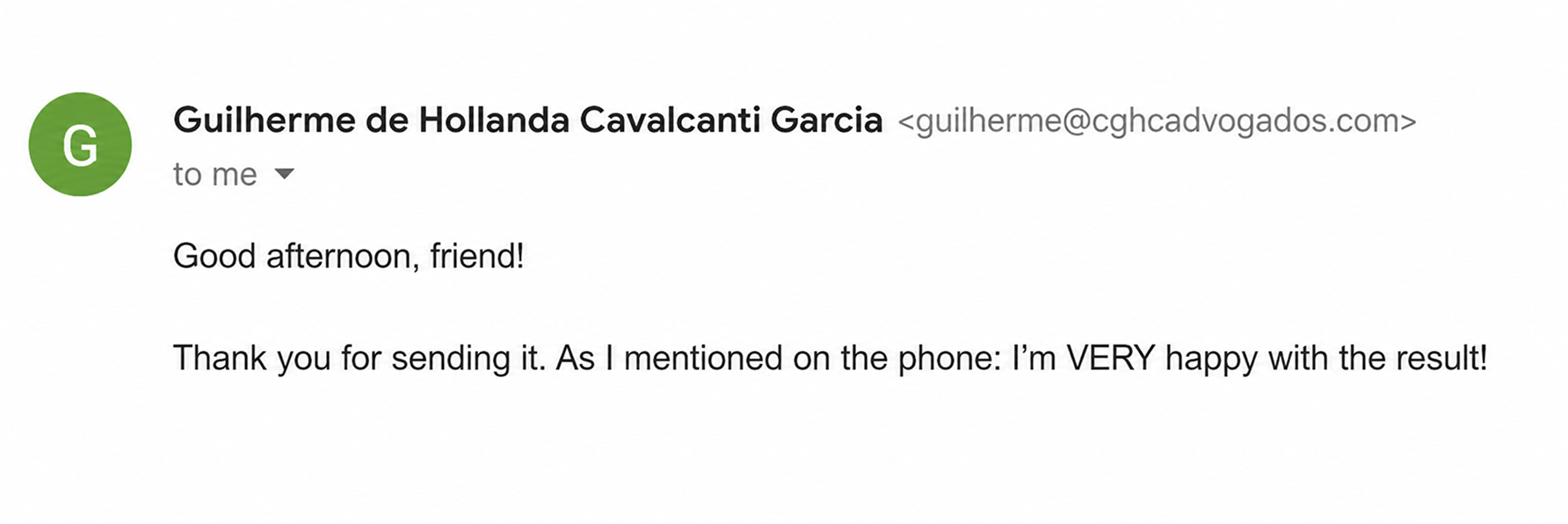
The transferable result isn't a fabricated metric. It's the method: a positioning problem correctly diagnosed under a surface request, a front-loaded process that produced a clean first pass, and execution carried all the way to a working front end.