
The problem
AMM CompraFácil is a public procurement portal: government bodies publish bidding processes, private suppliers compete for them. Before either side can act, the organization has to be registered, and under Brazilian procurement law that registration is heavy. Legal classification, institutional address, a legally accountable representative, notarized documents, formal declarations.
The domain is genuinely hard. Procurement law carries its own taxonomy: administrative spheres, branches of government, direct versus indirect administration. The people filling this in are municipal staff, not administrative-law specialists. A stated requirement from kickoff was that the system had to hold the user's hand, because the subject matter never would.
The data volume is set by statute, not by us. Roughly 45 data points and 7 document attachments across the full registration, with almost nothing optional in a way design could remove.
And there was no save. A stakeholder decision made under schedule pressure, four months to put an entire procurement platform in production, ruled out a draft state. The registration had to be completed in a single session.
That third constraint turned a form-design exercise into a risk problem. Without a draft, an interruption costs the whole registration, not a field. A user who hesitates over a legal term, or steps away to find a document, comes back to nothing.
Reframed problem: the challenge wasn't collecting the data. It was making a long, legally dense form survivable in one sitting, cutting every second, every decision and every moment of doubt that could make someone stop halfway.
Approach
The process wasn't mine to design. Under the deadline, project managers ran requirement definition with the domain specialists while design worked the screens in parallel. I argued against it. Requirements mediated through a third party, with no direct designer access to the specialist, looked likely to produce gaps. It did. So I built a control around it.
An AI-assisted pipeline, with the judgment kept human.
- Retrieve. Jira specs, competitor benchmarks, validated screens
- Generate. Functional HTML prototypes, step by step
- Audit. Every requirement gap returned, never assumed
- Refine. Production screens rebuilt in Figma
- Ship. Tokens exported as JSON, handed to development
Context came from validated screens rather than written description, carrying real components, real spacing and real type scale, anchored to daisyUI, the library the developer had chosen for speed.
No gap filled by assumption. Before designing anything, each spec was read against the flow and every ambiguity, contradiction and missing field returned to be resolved with the specialist, rather than interpreted and shipped into development as a guess.
The prototype became the audit instrument. Building what the spec described surfaced three classes of error that no amount of document review would have caught: fields collected at registration that vanished from the view screen, information demanded on consultation that was never captured at the source, and the same concept carrying different names across documents. Each one would have reached a developer as a design decision and come back as rework.
One place I did go to the source. When a spec asked for Administration: Direct or Indirect as a user-selected field, I checked the underlying statute rather than accepting the field as written. That check produced the flow's central decision.
Key decisions
Every decision below traces to the same constraint. In a flow the user can't pause, the design currency isn't polish. It's removed friction per screen.
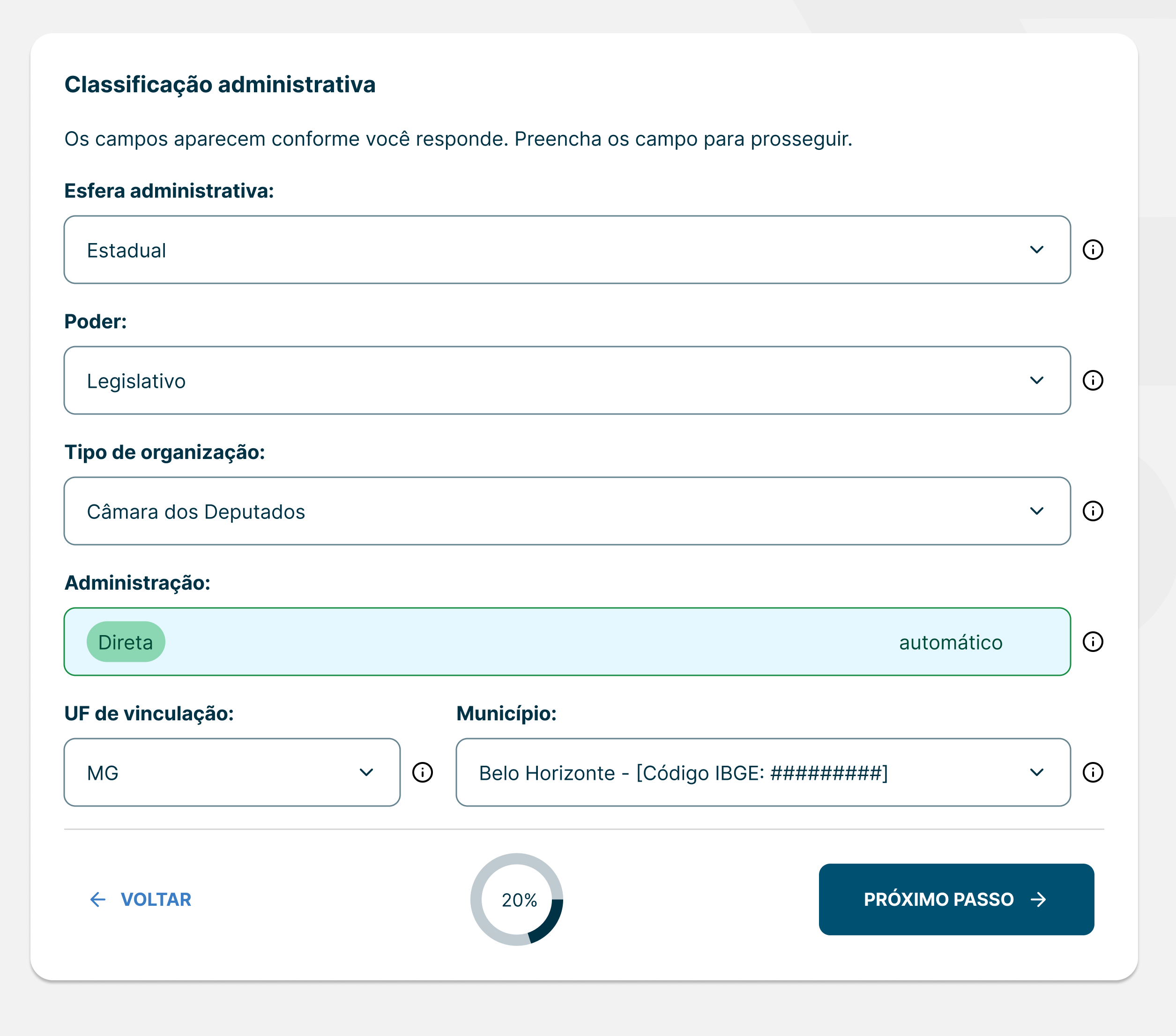
Derive instead of ask. Administration isn't an independent choice, it's a consequence. A city hall is always direct administration, an autarchy always indirect. Asking for both is redundant, and it permits impossible combinations submitted in good faith. So the question was removed. The user picks the organization type, a concrete noun they know because it's the name of the place they work, and the system fills the legal classification, locked, labeled automatic.
One change, three results: one fewer decision in the critical path, an entire class of invalid entry made structurally impossible, and a user who learns the legal classification of their own organization instead of being tested on it.
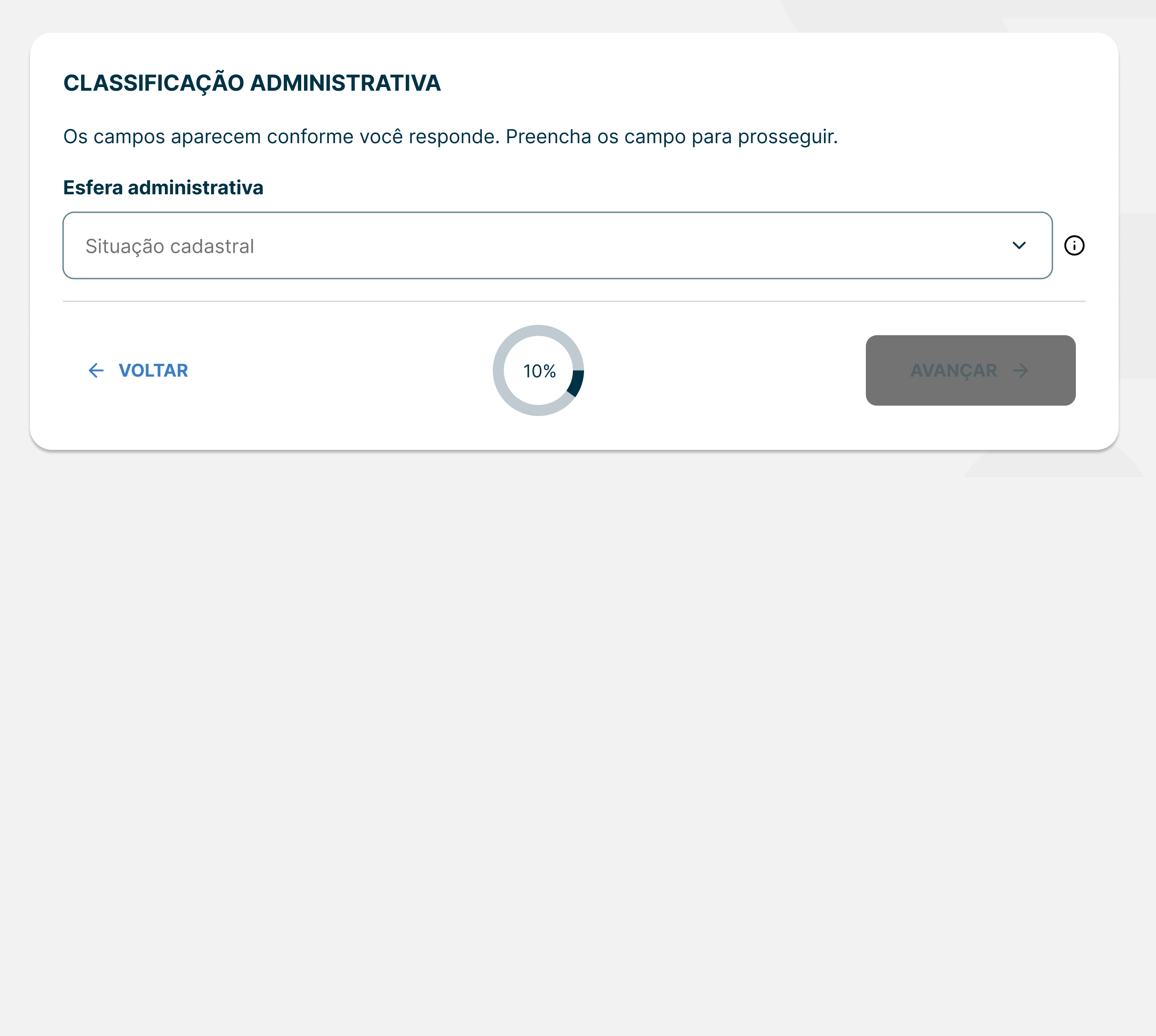
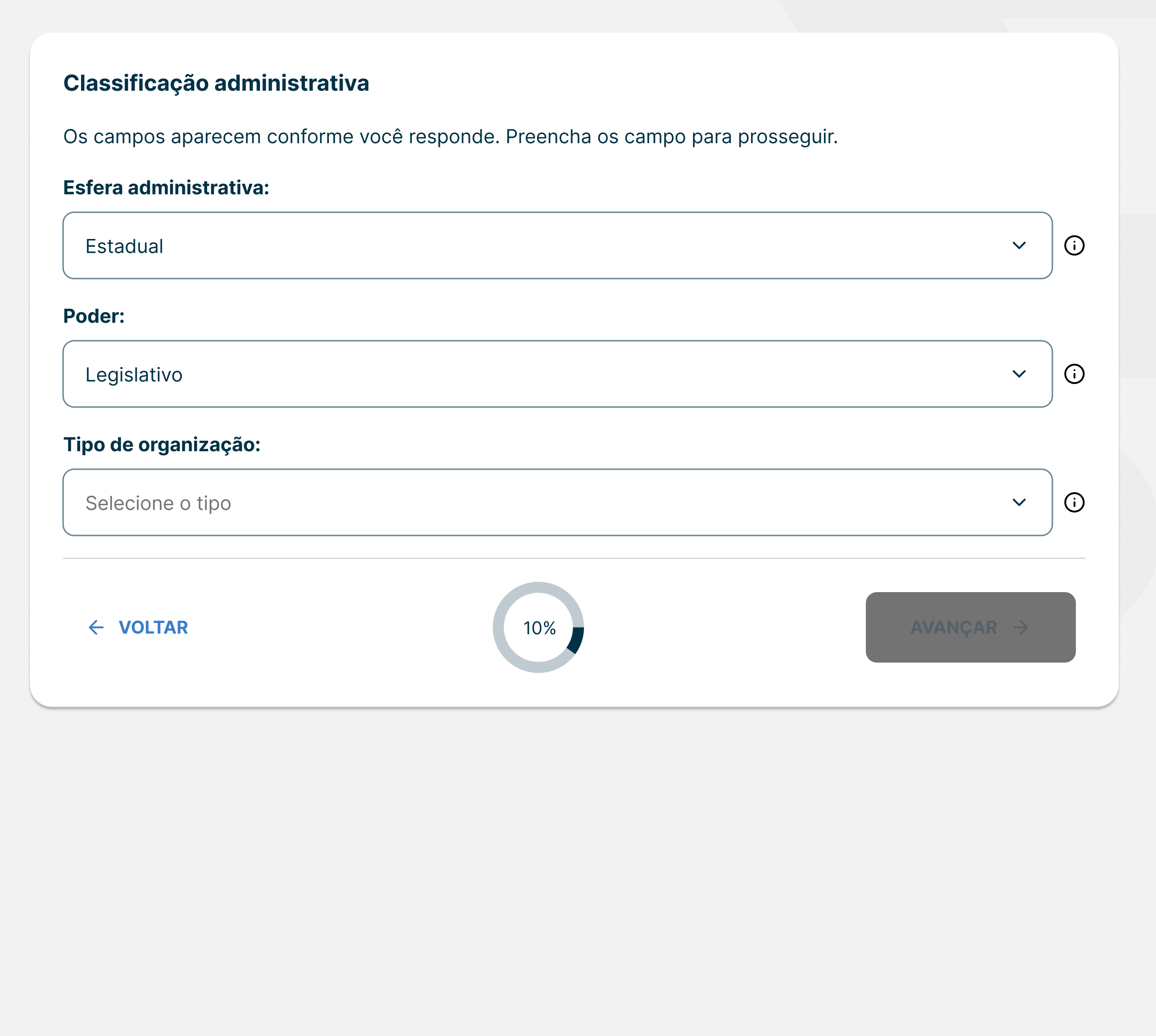
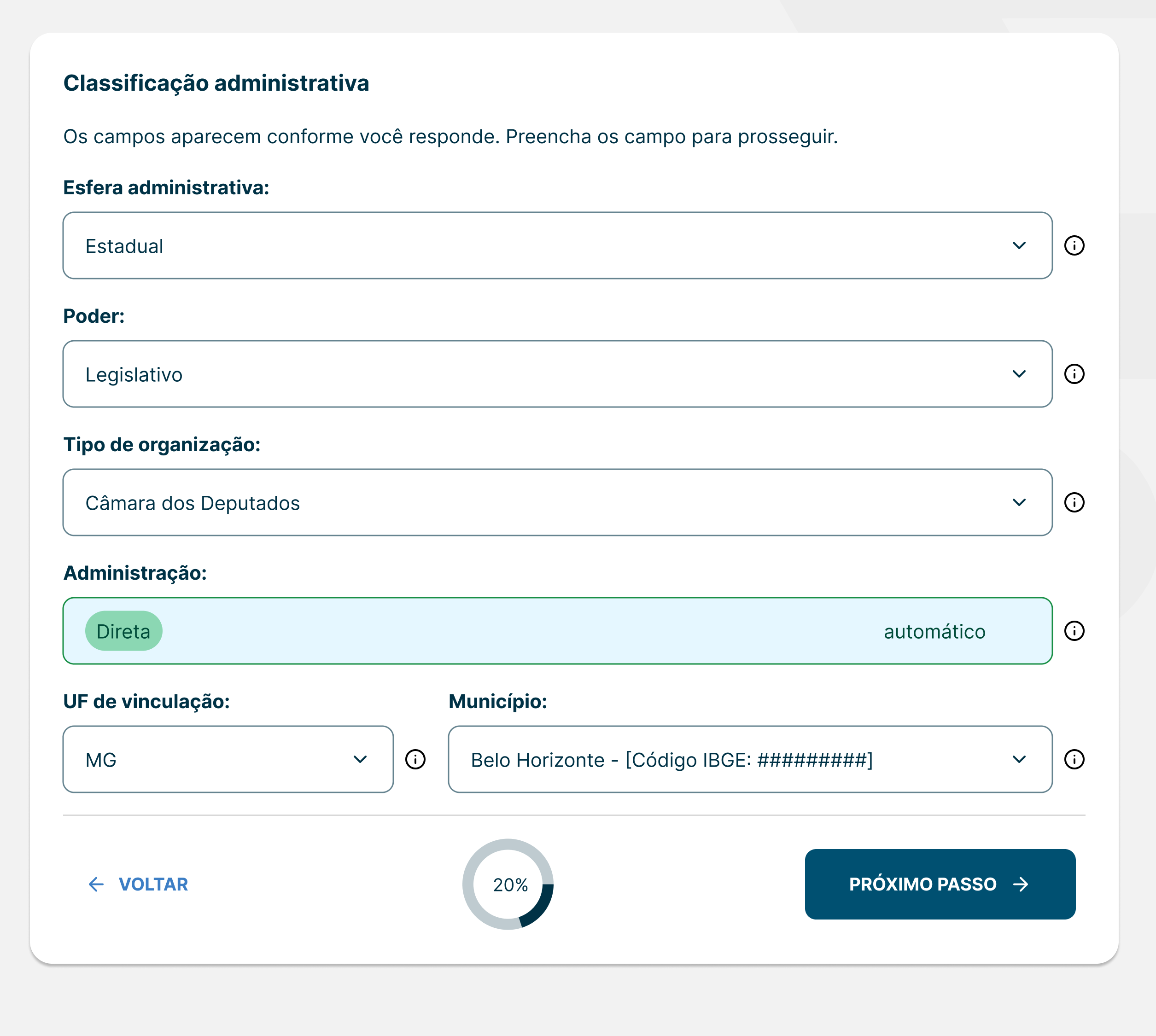
Reveal instead of dump. Step 2 holds eight fields with dependencies running between them. Shown at once it's a wall, and a wall is where someone decides to come back later, which in this system means never. Instead the step opens with one question: administrative sphere. Each answer reveals the next field and prunes its options. Municipal doesn't offer a judiciary branch, because municipalities don't have one, and the interface says so rather than silently omitting it.
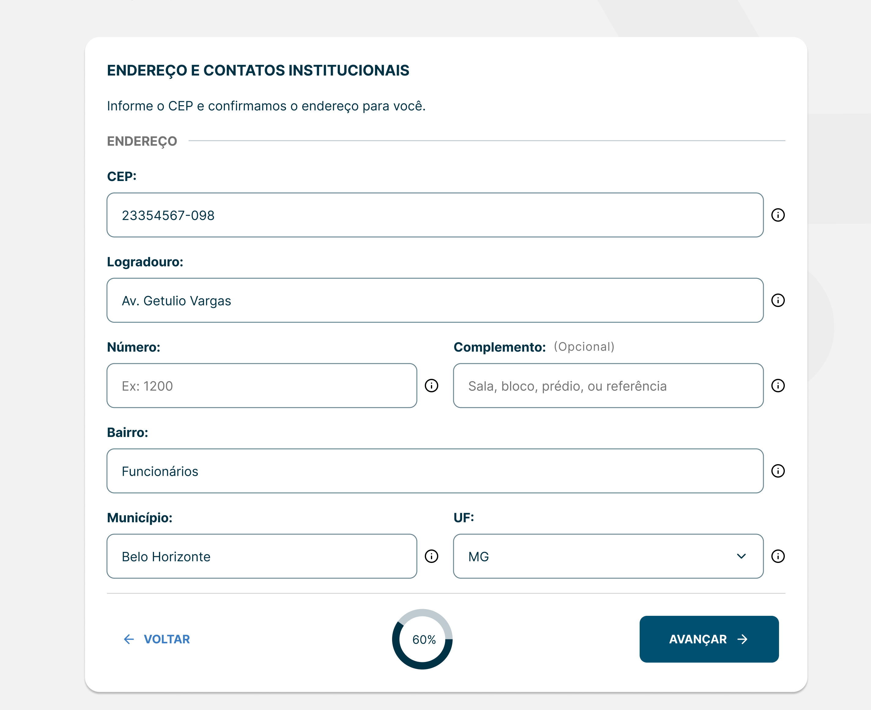
Fill instead of type. The address step runs on a postal-code lookup. Street, district, city and state arrive pre-filled and locked, each individually unlockable if wrong. The user types the code and the street number, the two things the lookup can't know. Four typed fields removed from the middle of the flow, where the cost of abandoning is already high.
Inherit instead of choose. The documents step asks for institutional paperwork, but which documents depends on what the organization is, decided three steps earlier. Rather than presenting a full checklist and asking the user to judge what applies, the step arrives already filtered. An autarchy sees its creation statute and bylaws. A city hall sees the creation statute marked not applicable, with the reason stated. The user never has to decide whether a legal document applies to them.
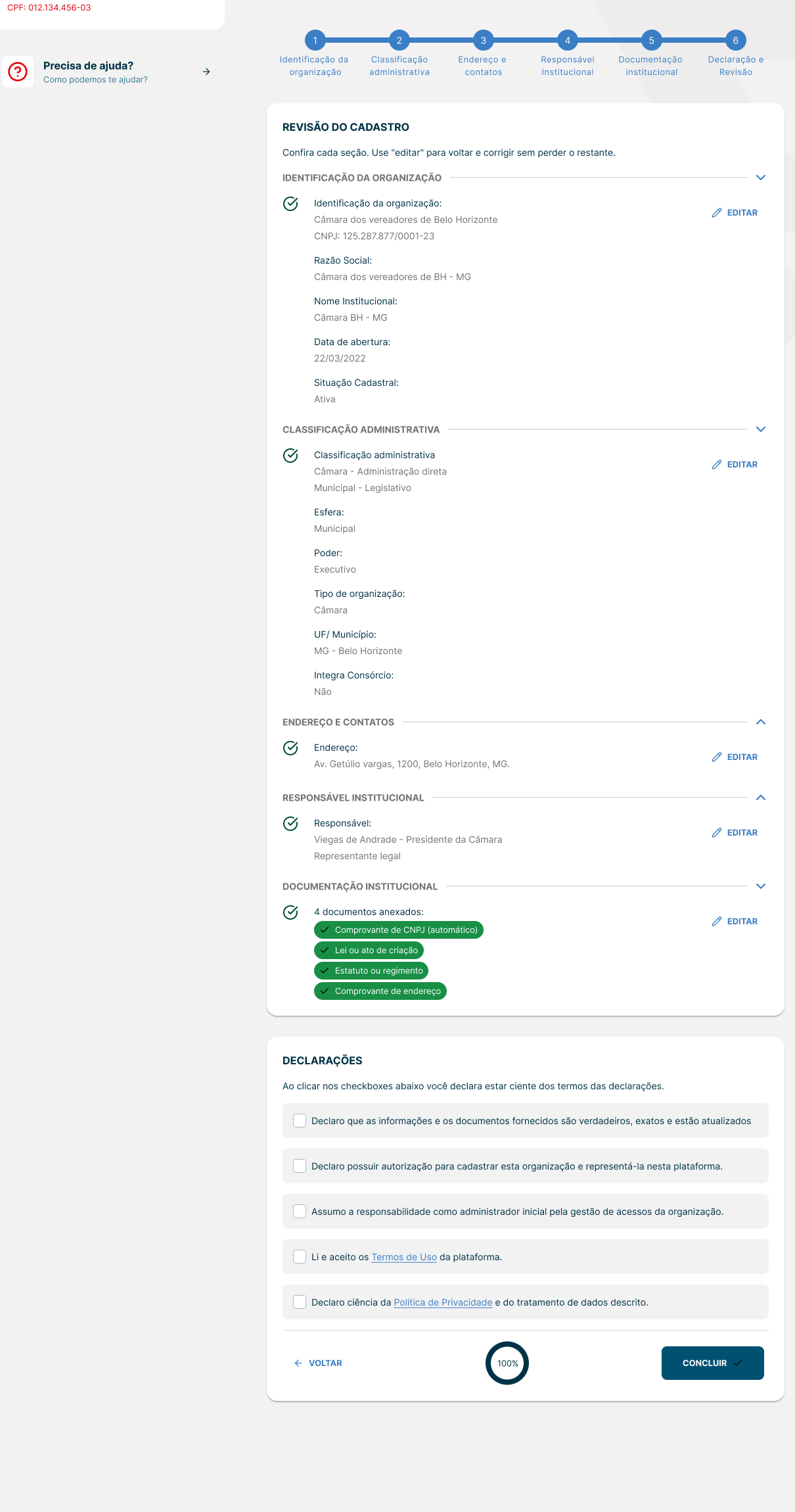
Make the ending visible. At review, an incomplete submission doesn't just grey out the button. A checklist states exactly what's missing and how many items remain. Goal-gradient reasoning applied at the worst possible moment to lose someone, the point where walking away costs the most.
Delivery
Prototypes as the working medium. Each step shipped as a functional single-file HTML prototype, with conditional cascades, postal lookups and derived fields all live. Not a clickable mockup: something a stakeholder could fill in wrong and watch what happened. Broken prototypes are data, and that's cheaper to learn in a browser than in a sprint.
Then Figma, deliberately. With no design system committed to a repository, because design and development were building the system while the project ran, production screens were rebuilt and refined in Figma from those prototypes. That second pass caught component inconsistencies the generated markup hadn't resolved, and became the point where the system was actually enforced.
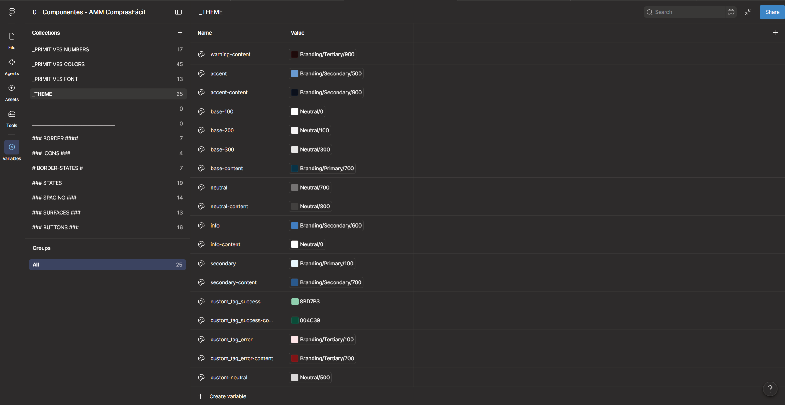
A token contract instead of a repository. Three-layer architecture (primitives, semantic, component), named against daisyUI's fixed vocabulary rather than my own labels, so designer and developer point at the same address with no translation table between them.
Exported as JSON and re-sent on every change. Across the whole project that happened four to five times, and every revision was an added custom color, never a structural fix. The architecture held from the first export to production.
Handed to development and followed through. Built by the development team against the Figma screens and the token export, inside the four-month window for the full platform.
Outcome
Presented and approved by the client on the first pass. Built, through QA, and in testing, inside the four-month deadline for the entire platform.
The transferable result isn't a conversion metric; the product hasn't launched. It's what the constraint produced.
A technical limitation arrived as a restriction: no drafts, complete it in one sitting. It could have been treated as an obstacle to work around, or as grounds to argue the requirement back. Treated instead as a design brief, it produced a sharper flow than a save button would have. Fields derived rather than asked, values filled rather than typed, decisions revealed one at a time, documents filtered before the user ever had to judge them.
The form got shorter because it couldn't be paused.